I missed the colour discussion? Oh man.
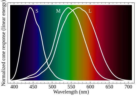
We can fully map the way human eyes work using a three-dimensional chromaticity diagram where each axis is the stimulation of one of the three types of cones (sensitive to violet, green, and yellow respectively), the combination of different responses of cones producing different colours; this is the only "correct" way of presenting human-perceived colour - however, it's not intuitive, not useful for displays, and hard to perform mathematics on.
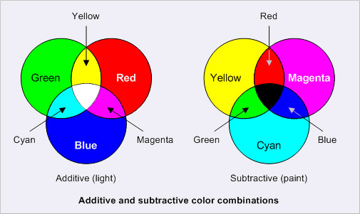
RGB is a cuboid (or rather, parallelepiped) section of this space, with axes arranged such that the maximum amount of human-perceived colour can be represented. The axes chosen represent the strength of light from three wavelengths - blue at ~440nm, green at ~510nm, and red at ~645nm (RGB doesn't actually specify these values). This has the advantage of making (0,0,0) be black, and (1,1,1) be white, as well as having the mean of all three values be a decent approximation at the luminosity of the colour. It also means that you can represent a wide array of colours with just three different wavelengths.
CMY is merely an inversion of RGB; it describes the absorption of such wavelengths rather than the emission, and is used in printing because it's how ink works.
RGB/CMY are not particularly useful as far as selecting a colour goes, though. Yes, they represent luminosity fairly well, but how does (1,0.8,0) relate to (0.6,0.2,0)? Clearly the latter is darker, but is it a darker shade of the same colour? (The answer is no; the former is yellow with a very slight orange colour, whereas the latter is a reddish brown.)
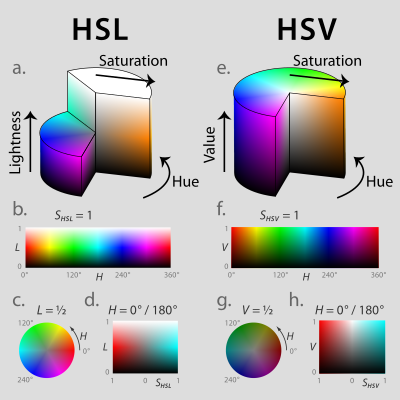
HSL/HSV are useful for this, as it represents the way we generally think of colour. HSL is a double-cone model that puts black at 0 lightness, white at 1 lightness, and the pure hues at 0.5 lightness; at 0 saturation, HSL produces shades of grey from black to white, whereas at 1 saturation it produces the strongest colour available at that lightness (which is black or white at 0 or 1 lightness respectively).
HSV is slightly different, in that it's a single-cone model that puts black at 0 value, and pure hues and white at 1 value; at 0 saturation, HSV produces shades of grey from black to white, whereas at 1 saturation it produces the strongest colour available at that value (which is black at 0 lightness, but a full colour at 1 lightness).
These two are similar but different; however, in either case, you can see the relationship between colours. In both cases, hue is represented as an angle, with red at 0 degrees, green at 120 degrees, and blue at 240 degrees. You can tell quite easily in HSL that (180,0.75,0.5) is a vibrant cyan with a slight grey tone, and that (270,1,0.2) is a deep violet, and can compare each aspect directly (in addition to the difference in hue, the former is less saturated but brighter than the latter). With the HSL model, you can find complementary colours simply by adding/subtracting 180 degrees to the hue, and you can find different shades and tints of the same colour by adding/subtracting to the luminosity.
However, they're funadmentally flawed in a number of ways. Firstly, they're both transformations of RGB, so it still suffers the problem that it doesn't represent all of human colour perception. Secondly, they don't deal well with colours that are near-white (in HSL, Alice Blue has the same saturation as Azure, despite one clearly being more saturated than the other; in HSV, pure hues have the same value as white, despite white obviously being brighter).
Finally, we have CIELAB and related colour models, which represent the way colour is interpreted by the brain. It's incredibly unintuitive, but it's a simple three-value model that captures a good deal more of the human colour gamut than RGB does. It uses lightness in a similar way to HSL, but uses its other two dimensions for magenta-green and yellow-blue. And this can also be represented in a double-cone model like HSL, each value having a similar representation, with the equivalents of saturation and luminance corresponding more accurately to their expected values. This is the middle ground between "simple" and "computationally expensive", and is probably the best colour model to use to represent human colour perception.
You'll notice that throughout I've referred to "human colour perception". That's because you'd have to adjust the values significantly for other trichromate-sighted beings, and throw them all out of the window entirely and start from scratch for anyone with four or more colour cones.
Post
Tue May 16, 2017 12:59 pm
#46
Re: Colors are weird, man
Games I like, in order of how much I like them. (Now permanent and updated regularly!)