I have to chime in on the X3 series of games too. The UI has options that are greyed out until you "explored" properly. Giving the player absolutely zero clues to what needed to be done is frustrating. If you've never played that game, I can tell you that the "exploration" that players end up doing is going to google to find out why the game is broken, instead of actually playing the game as intended. I'm definitely guilty of that.
I'm all for exploring and discovery. But please, give us a hint, like "You need Tech level 3" or "You lack crystals to do this" when you mouse over something. No hints is a cheap way to masquerade for "game exploration" and causing innumerable game restarts. Screw that game. There is a difference between terrible UI, and game exploration. Know what I mean?
Post
Thu Jun 12, 2014 6:42 am
#17
Re: UI
I came into this thread having no problems with BBR but by the end...you have convinced me, the UI should be changed. Let me start off by saying that I still think the BBR are still fine as a UI. I have no problems with them but I think the UI could be better. They are missing the "wow" effect that we saw from the purely nodal UI of the previous updates. Everything is just black rectangles...almost anyone could make that. There is nothing interesting in the UI, you only want to use it for the most minimal time needed so you can get back to the game and look at something more interesting. That is not to say the tech behind the UI isn't interesting. As I understand it almost everything UI is using the nodal interface it is just that the nodes can now take any shape they need to - which is cool - but rectangles are pretty boring.
Personally I think that BBR were chosen so that gamepads/joysticks could easily navigate the menu system. I understand why it probably has to be done but maybe we could have 2 UIs that the player can choose. BBR and something similar to the UI from the previous updates. Just tossing out ideas.
I think that came out more harsh than I meant it. Don't take it that way, it was not how I meant it.
Post
Thu Jun 12, 2014 7:22 am
#18
Re: UI
I really hope Mr. Parnell takes all of this into consideration, after he's done with his current project. The nodes were simplistic, elegant, and worked wonders for anything that wasn't an enormous list. They were... more fun. 
Have a question? Send me a PM! || I have a Patreon page up for REKT now! || People talking in IRC over the past two hours: 


Post
Sat Jun 14, 2014 6:06 am
#19
Re: UI
The problem is that long lists are inherrant to a game like LT. The UI needs to be able to handle close to infinite ammounts of entities.Talvieno wrote:I really hope Mr. Parnell takes all of this into consideration, after he's done with his current project. The nodes were simplistic, elegant, and worked wonders for anything that wasn't an enormous list. They were... more fun.
Post
Sat Jun 14, 2014 7:07 am
#20
Re: UI
Yes, but, there are many places where the old nodes would really work.
Or...
Here's an idea. Why not hybridize the UI?
You have your old shipnode hardpoint model: a group of nodes overlaid on top of the ship you're looking at. This is on the left half of the screen, perhaps on top of a black rectangle. Against the right edge of the screen, you have the new node system - a series of black rectangles - a display - that tells you everything you need to know about the hardpoint you're mousing over. If you click a hardpoint, the right side of the screen expands into a list of options detailing not only that hardpoint's data, but a list of options of what you can do with that hardpoint.
Also, if you remember, the old node system was very pretty, compared to the new one. It was unique to LT - something that made LT special.
Last edited by Talvieno on Sat Jun 14, 2014 7:19 am, edited 1 time in total.
Have a question? Send me a PM! || I have a Patreon page up for REKT now! || People talking in IRC over the past two hours:
Post
Mon Jun 16, 2014 2:26 am
#22
Re: UI
i dont really care what josh decides to do, as long as it works. i just want to warn josh not to try and reinvent the wheel if he doesent need to.
Post
Sun Jun 22, 2014 7:23 am
#23
Re: UI
after thinking long and hard about this i have come to the conclusion that the most important thing about the UI is not baking it in. it needs to be drop in drop out so if it works, cool, if it doesent modders can just replace it. this is what kills X-rebirth, it has baked a gamebreakingly bad UI into the core of how the game works.
Post
Sun Jun 22, 2014 7:52 am
#24
I also want to join my opinion to the poll of those who think that good, clear UI is paramount. I had a chance to play Haegemonia and its horrible UI turned me off this game, while at the same time I was a huge fan of Imperium Galactica, done by the same developer. It shows how important UI can be.
Re: UI
My thoughts exactly.I have to chime in on the X3 series of games too. The UI has options that are greyed out until you "explored" properly. Giving the player absolutely zero clues to what needed to be done is frustrating. If you've never played that game, I can tell you that the "exploration" that players end up doing is going to google to find out why the game is broken, instead of actually playing the game as intended. I'm definitely guilty of that.
I also want to join my opinion to the poll of those who think that good, clear UI is paramount. I had a chance to play Haegemonia and its horrible UI turned me off this game, while at the same time I was a huge fan of Imperium Galactica, done by the same developer. It shows how important UI can be.
Post
Thu Jun 26, 2014 1:44 pm
#25
Re: UI
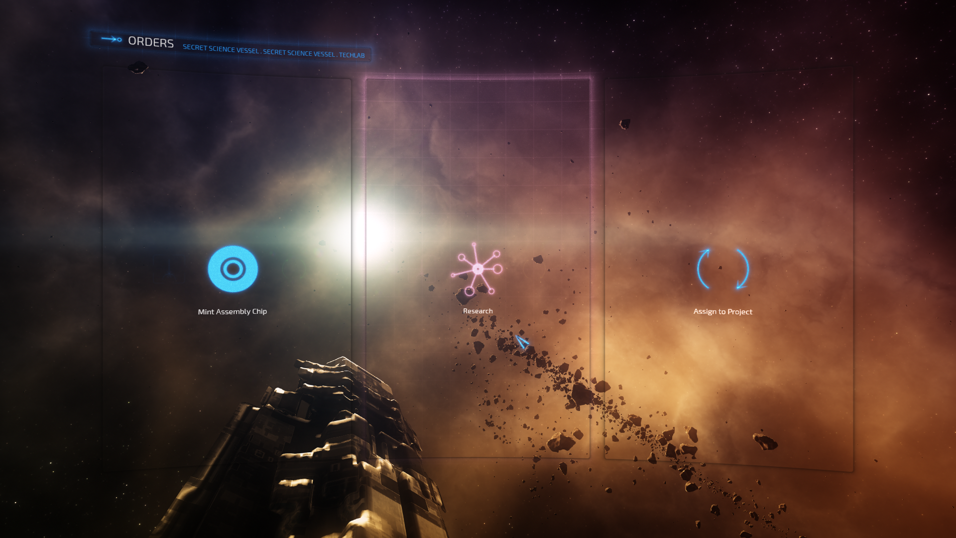
I do find this really pretty, though. I just don't care for the big black boxes.
Have a question? Send me a PM! || I have a Patreon page up for REKT now! || People talking in IRC over the past two hours:
Post
Thu Jun 26, 2014 1:59 pm
#27
Re: UI
These black boxes. I love the gridlike background in the image above... not so much the black boxes. LT is pretty, and black boxes don't do much for pretty.

Have a question? Send me a PM! || I have a Patreon page up for REKT now! || People talking in IRC over the past two hours:
Post
Thu Jun 26, 2014 2:22 pm
#28
Re: UI
It was a joke Talvieno. Maybe not a good one, but I have an excuse: the beauty in the background! 
Post
Thu Jun 26, 2014 3:01 pm
#29

Re: UI
Lum wrote:It was a joke Talvieno. Maybe not a good one, but I have an excuse: the beauty in the background!
My Signature
Post
Fri Jun 27, 2014 9:40 am
#30

Re: UI
The first one, hands down.Zanteogo wrote:Lum wrote:It was a joke Talvieno. Maybe not a good one, but I have an excuse: the beauty in the background!