I like the scanner, but... I'm kinda with everyone else that the polar plot doesn't really do it for me - polar means space, linear means time. That's pretty much how we're used to interpreting graphs.
I could get used to it in about five minutes of course, it's not that hard. But, frankly, if you're doing both time and frequency variant signals, the polar plot will be way limited. The most intuitive way to display those is with a waterfall plot or a spectrogram. Get a spectrographic analysis of a signal up and the human pattern recognition system means you'll start to recognise even complex patterns really easily.
And, entirely personally, I think spectrograms look way cool as well as being a totally badass way to display plot frequency variation against time.
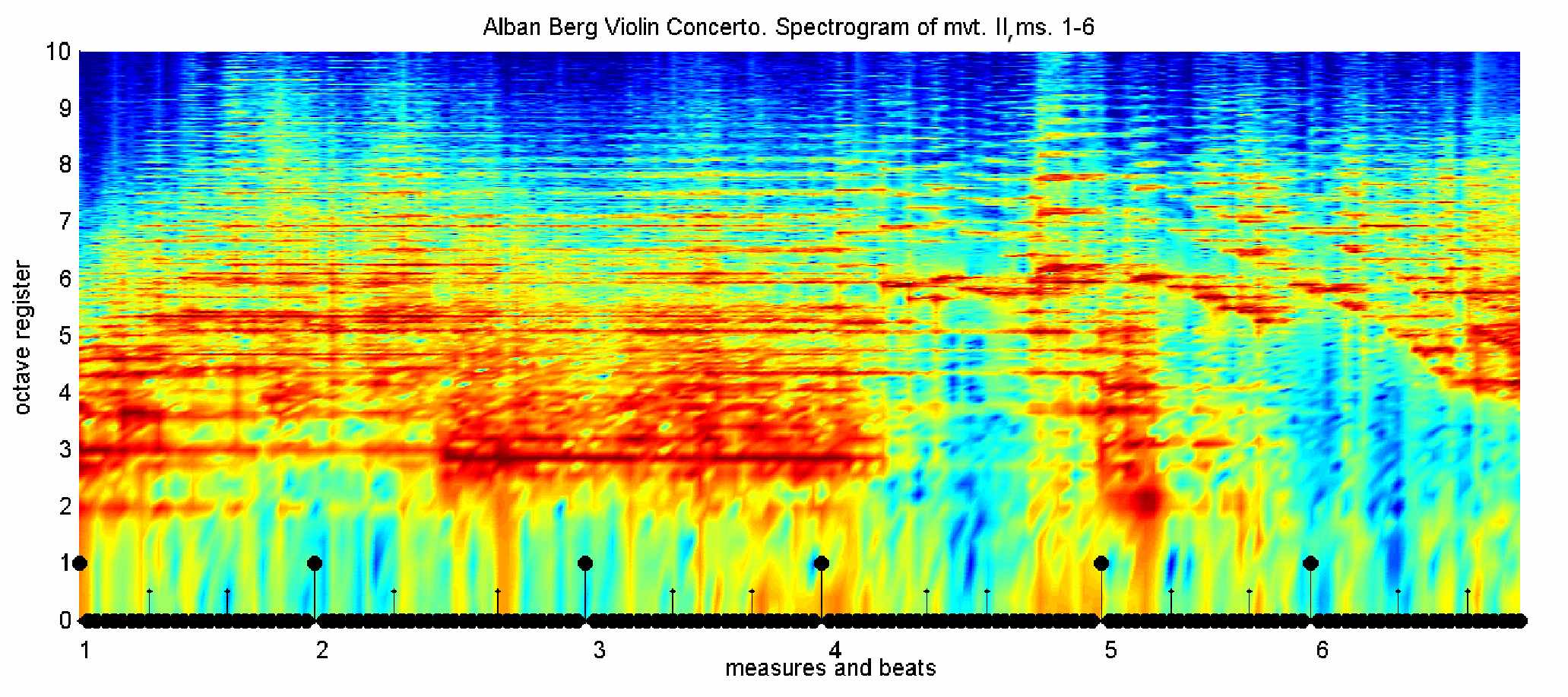
Example,
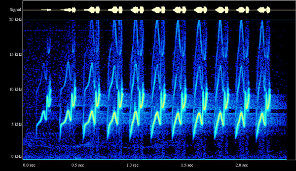
example.
Of course in theory you could wrap the time axis of a spectrogram around a circle, if you wanted. I'm not totally convinced that would be a better look at it if you wanted people to get into the mode of easily recognising patterns, though.
Although, really really, what you actually want are lots of different ways to present the raw scanner data to the user, that we can pick and choose. Give me a window with a spectrum analyser, a time series waveform and an FFT spectrogram and I'll be happy


